Overview
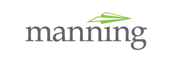
The company I had been working for in Chicago needed to make a pretty drastic identity change. He had worked with different iconography and ideas for weeks and finally came up with using a paper plane. The main issue was figuring out how it would be used with the logotype of the owner’s name. The original ideas featured the plane taking the place of the dot in the eye, which is pictured first. This was my preferred version of the logo as well as the other designer on the project.
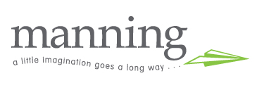
The second logo featured is what the client decided on and went with.


